Pages

Friday, April 27, 2012

Repo - UniCredit 2010 v. 2011


There has been a rush in the U.S. to attribute the financial crisis to a haircut spiral and a run on repo.  Without tackling that claim (which we believe to be false), it is 
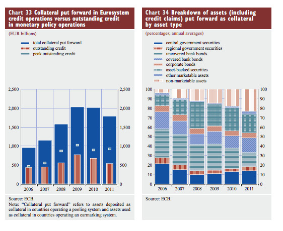
interesting to look at the balance sheet of Unicredit – a particularly stressed Italian bank and how it has evolved from year end 2010 to year end 2011.  One might therefore expect that the bank would be experiencing problems in repo financing. 

But look at the following two charts (source: UniCredit 2011 financial presentation) UniCredit increased its repo borrowing across the board, including a huge increase (almost 200%) increase in central bank funding (and this is not including the 2nd LTRO).  But private repo borrowing also increased 17% on a gross basis and on a net basis (repo borrowing – repo lending) UniCredit increased its funding from private repo by over 24 billion euros.  This picture is in line with some of the stuff I posted yesterday showing the increased preference for secured liabilities over unsecured.


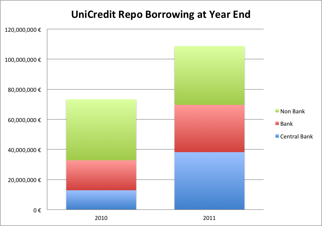
Some words of caution – the data is on a consolidated basis, and UniCredit obviously has operations outside of Italy.   As the ECB's VP Vitor Constancio admitted in a speech today on shadow banking, good data on repo is  hard to come by.  

Thursday, April 26, 2012

Non Domestic Deposit Declines & Secured v. Unsecured

Much has been made of deposit flight from peripheral countries as a way of explaining why banks in those countries have come under pressure.  In the past year in Italy domestic deposits have actually risen as a % of total liabilities, while deposits from other non-domestic sources have declined (charts are mine data is from Bank of Italy).


The ECB tells a similar story with the following chart, which depicts the overall level of non-resident deposits in French, Italian and Spanish banks along with the ratio of deposits to total assets.


The following chart shows a rise in Italian deposit rates over the past year (chart is mine source Bank of Italy).

Given the stress in Italy the rise in deposit rates appears somewhat gradual and certainly not fast enough for many non domestic depositors who have fled.  Perhaps the ability to access cheap secured financing at the ECB has suckered banks into financing themselves increasingly with secured liabilities.  As it so happens, at least on a cross-border basis, the ECB is only encouraging banks to continue doing what they have been doing for the last 9 years - financing more of their non-domestic liabilities via secured borrowing.  The following chart shows money-market transactions with non-domestic counterparties in the Euro-area since 2002. 


Cross Border Collateral in Eurozone

The ECB has released a flood of data in the past couple of days.  Here is some interesting stuff from the Bank's report on "Financial integration in Europe."

Chart 54 demonstrates the deterioration in cross border collateral posting in Eurosystem operations since the onset of the crisis.  Cross border collateral posting occurs when a bank in one country, say Germany, buys a loan or security in another country, say Spain, and then finances it by accessing Eurosystem refinancing at the Bundesbank.   From the ECB


A higher share of cross border collateral posted with the Eurosystem would suggest more cross border ownership in general.   As the chart shows, cross border collateral posting has gone from over 50% of Eurosystem collateral to around 20% in 5 years - probably not a good sign for European financial integration.


Wednesday, April 25, 2012

Tidbits from ECB Annual Report #2 (Collateral again)

Compare this new chart and the one I posted before (reposting).  As a way of determining where the market thinks ECB repo as a subsidy it might be instructive to compare the overall eligible collateral by asset type (chart 32) with the actual percentages posted at the ECB (chart 34).

For example, let's look at non marketable assets.  The ECB does not provide data behind the tables, so we'll have to do a rough estimate.  Non-marketable assets are made up of credit claims, non-marketable retail mortgage backed debt instruments (Ireland only), & fixed-term deposits. (see section 6.4.3.1 here).  The ECB says that non-marketable assets are "mostly credit claims".  If you compare the rough percentage of credit claims as a percentage of "eligible collateral" with the percentage breakdown of assets actually posted it seems that the ECB must be offering a pretty good deal with respect to financing of credit claims.  A few things to consider:
1) The ECB does charge high haircuts on credit claims (can be found in document linked above and according to M. Draghi the average haircut on new credit claims accepted was 53%).
2) The ECB admits it has a hard time estimating the amount of eligible credit claims so its possible/likely the amount is bigger than their graphics show.


Nevertheless, the data does demonstrate that the ECB's acceptance of credit claims for repo must somehow present an advantage vs. the private market.  Whether this is due to lower haircuts, lower rates, perhaps easy credit scoring offered by NCB's making the procedural aspects of actually pledging whole loans easier, is unclear.

I did post earlier some time ago about subsidies that are easier to observe - as of late 2011 those included sovereign debt in the periphery (especially Portugal but also Italy and Spain).

Tidbits from 2011 Annual Report #1 (ECB Collateral)


It is interesting to observe the excess collateral posted with the ECB.  It might come as surprise (certainly was to me) that European banks store a good deal of excess collateral (more than required for borrowing) with the ECB.

Explanations for why banks leave excess collateral with the ECB range from
1) perhaps an easy way of signalling that they have a certain amount of unencumbered assets
2) leaving assets at ECB might be safer than at other custodial bank (free and safe custodial services)
3) extra-collateral may only be extra in some part - if total collateral is measured free of haircuts then real "excess" (assuming say a 20% blended haircut on ECB assets) should be reduced by the the average blended haircut.

The average percentage of excess collateral actually increased in 2011 (though by year end when lending dramatically increased this might not be the case).  To the ECB this mean that "at least at the aggregate level, the Eurosystem's counterparties experienced no shortage of collateral."  Of course such a claim is somewhat meaningless given what we know about the balance sheet of various NCB's.  German banks are swimming in excess liquidity while there is little to be found in Italy - by the same token it is likely that German banks post much of the excess collateral and Italian banks post very little (though it is hard to verify this since the ECB does not release this data).

On the right hand chart note the change in composition of assets.  While observers might not be surprised that "non-marketable assets" jumped as a % share of posted collateral, they might be more surprised to know that this figure is not influenced at all by the change in collateral rules which widened the scope of acceptable credit claims (non-marketable assets).  Those changes only took effect in 2012, so it is likely that a current snapshot of collateral posted with the ECB would show that the percentage of credit claims posted is even higher than the average for 2011.

Also of note - uncovered bank bonds declined as a percentage share of posted collateral mainly because many such bonds became ineligible as state guarantees from the first financial crisis wore off.  I wonder whether the ECB's decision to allow unlisted bank bonds starting in on January 1, 2012 was in response to this and also whether, as a result, the share of uncovered bank bonds posted during 2012 will rise again?

Tuesday, April 24, 2012

Updated Target Imbalances

It's not easy to find this data and I have not found all of it but here is a much more detailed look at Target2 imbalances (in euro billions) among the various eurosystem countries going back to January 2011.


Monday, April 23, 2012

Fed demonstrably settles interdistrict imbalances in 2012

It is hard to find much written on the subject of Fed interdistrict imbalances.  Virtually everything I know comes from this great blog http://jpkoning.blogspot.com/search?updated-max=2012-03-17T10:42:00-07:00&max-results=7  (see the Feb. 5th entry in particular).  In short, according to the Fed's accounting manual, it settles imbalances that build up between the districts every in April by taking the average imbalance over the course of the year and then shifting SOMA securities from the debtor districts (biggest: Richmond) to the creditor districts (biggest: NY).  There was some speculation last year that the Fed had not fully settled (hard to know for sure because cannot totally isolate the data) the imbalances because they were concerned about the Richmond Fed getting close to negative equity after transferring SOMA securities per the Fed's formula.  In any event settlement just happened this year and as you can see the imbalances have almost entirely disappeared.


Richmond's balance sheet shows that post its roughly $90 billion SOMA transfer it still has over $186 billion in SOMA securities so its safe from dreaded negative equity for the time being.